In this project, I redesigned an existing sales call center dashboard at Direct Insurance, specifically tailored for managers. The original dashboard was overloaded with data, lacked a clear hierarchy, and made it difficult for managers to quickly track team performance and identify issues. The goal was to create a more practical, user-friendly dashboard by focusing on key KPIs, simplifying the structure, and improving data visualization. The new design provides managers with real-time insights, helps monitor sales progress, and supports more effective decision-making.
Design Process
I audited the old dashboard and mapped the must-have KPIs for managers.
Then I simplified the layout into a clean, card-based hierarchy and added color-coded feedback (green/red) for instant status.
After a few quick iterations, the result is a fast, manager-focused tool that’s easy to read at a glance.
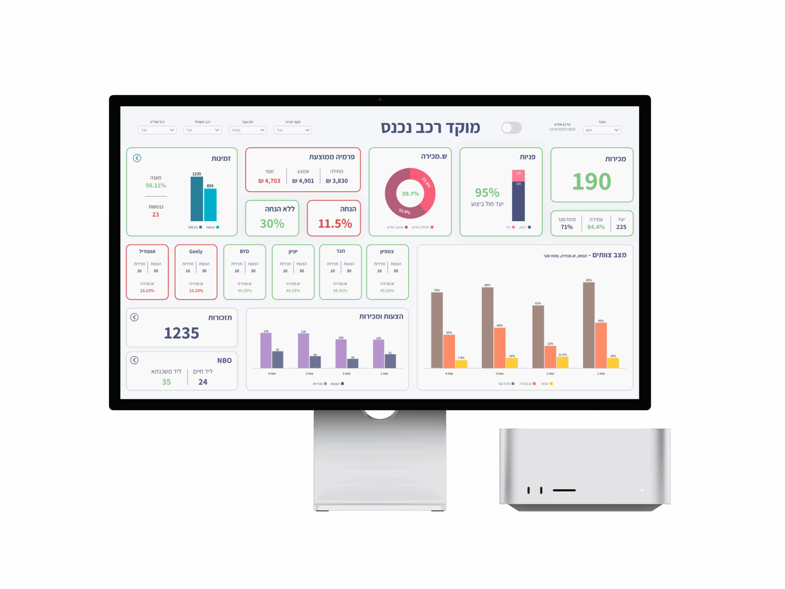
Final Dashboard
The final dashboard provides managers with a clear real-time view of team performance, improving decision-making and highlighting areas that require immediate attention.
Key Features
These are the core features that make the dashboard more intuitive and effective for managers
Center Overview & Teams View
See overall KPIs at the top and detailed team insights below
Color-coded Indicators
Instantly spot performance highs and lows with intuitive colors
Clear and Intuitive Graphs
Clear visualizations that highlight what truly matters
Insights & Learnings
Through the process of designing this dashboard, I learned how powerful simplicity can be. By grouping the data into clear sections, using color indicators, and focusing on visual storytelling, managers can now understand the status of the call center in seconds instead of minutes. The challenge was not only to design something visually appealing but also to make the experience seamless and intuitive. This project showed me that great design is not about adding more, but about making every element meaningful.
Enjoyed My Work?
Looking for my next design challenge — if you’re hiring or have a project in mind, I’d love to connect.